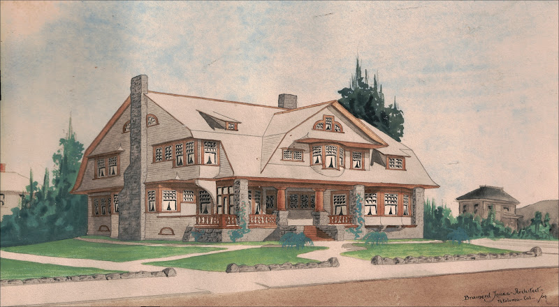
With MUCH gratitude to Harrison Comstock, we can now share Brainerd Jones’ preliminary design for Comstock House, painted in 1904.
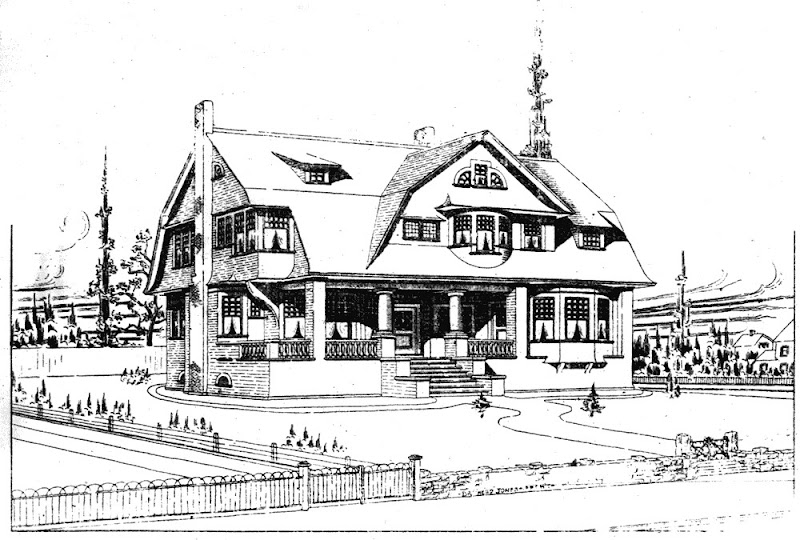
This watercolor shows several differences with his pen and ink architectural elevation (also shown below), which accurately represents the final design. Other historical images of the completed home can be found in the Comstock House photo gallery.
Two years before starting this project, Jones had completed the mansion-like Paxton House two doors down from close friends of Mattie and James Wyatt Oates, who now commissioned him to create their own home. As discussed in that article, the two buildings complimented each other. Both were in the cutting-edge Shingle Style with predominant roofs and asymmetric projections popping out everywhere.
One difference was that (the home that would become known as) Comstock House was smaller, with a footprint of roughly 60 x 40 feet. The watercolor shows the house was wider and deeper in Jones’ original design and almost square, adding considerable attic space and room for two more windows on the sides. The additional massing makes it less of a “little sister” to Paxton’s big place, but Jones achieved that by raising the roofline. This extended the upper slope of the gambrel roof much further than common on Dutch Colonial Revivals. making the house look a little squat. Worse, it undermined the genius engineering principles that distribute the gravity load in a traditional gambrel rafter-and-gusset frame – if built as shown, this house probably would not have survived the 1906 earthquake.
Also mirroring the Paxton House is the doorway closing off the south (shown left) side of the porch. The Paxtons had an enclosed porch room on their north side; this was likewise a semi-private space separate from the main porch.
A significant difference is that the street view first floor, the porch columns and chimney are clad in rusticated basalt, same as used with the fence surrounding the house. Stonework like this was a common element in Shingle Style. Also, the watercolor shows the house shingled in Eastern White Cedar, which turns silver-grey as it weathers. That kind of wood was specified in Jones’ notes to the contractor, although the more readily-available Western Brown Cedar was used instead.
There are other differences to spot. The front door is directly in line with the steps and not off-center; there is a window on the north end of the porch and not the traditional Dutch Colonial “coffin door,” which was probably needed to vent the smoke from Wyatt Oates’ cigars. The bank of Tutor-style casement windows seen to the rear left ended up on the other side in front. The carriageway is in front on Mendocino avenue and not on the Benton street side.
Sadly, there’s no floor plan to go along with this original design. But it’s pretty easy to tell that all the bedrooms and living rooms would have been a couple of feet larger on all sides. You can bet, however, the wretched servant would still have the smallest and coldest room in the house, no toilet except for the one off the back porch and a kitchen so miserable it could only have been designed by a man who never had to work in one.
 |
| Watercolor on paper, 16″ x 9¼” |
 |
| Drawing published in the Santa Rosa Republican – see photo gallery |
