meterFB

CITY OF ROSES AND PARKING METERS

Breaking news: People tend to have very strong opinions about parking meters. Also, this surprise: Those opinions are never favorable.

Yet Santa Rosa still has them, making it among the very few places in Sonoma county where the elusive meters can be spotted in the wild along with their related species, parking garages that charge money. And the reason we have them is because this is the city that time forgot – in Santa Rosa, it is always 1946.

This is the second in a series exploring the missed opportunities and regrettable decisions that have shaped Santa Rosa since World War II. Part one (“THE SANTA ROSA THAT SHOULD HAVE BEEN“) saw voters narrowly reject a chance to develop part of the downtown core into a Civic Center, which would have kept it the county’s hub during the postwar boom years and after.

Looking back on all the other times the city took a wrong turn, one name keeps popping up: Hugh Bishop Codding. When first planning this series I even considered naming it “How Hugh Codding Destroyed Downtown,” but that’s unfair – our city government and elected officials did the job on their own, advised by a parade of out-of-town “experts.” Yes, old Hugh monkeywrenched the town with lawsuits and sometimes jujitsued the city or county into doing something stupid, but mostly he took strategic advantage of their missteps. And sometimes he didn’t win; for example, there was his odd and long-running quest to convince the city of Santa Rosa to move out of the city.*

No, Codding’s not to blame alone; with remarkable consistency, when challenged to make a momentous decision our trusted civic leaders boldly rose to the occasion and (in my humble opinion) made the worst possible choices. The courthouse was torn down and a street plowed through courthouse square; Santa Rosa Creek was buried in a culvert; prime downtown acreage was bulldozed with most of it turned over to private developers; a shopping mall was constructed which immediately became the Great Wall of B street.

That record of stumbling mistakes began in July, 1944, while Codding was still a Seabee building quonset huts in the Pacific. That month the Chamber of Commerce held a luncheon to discuss the “parking bugbear” with a public meeting following a few weeks later. There the city manager announced he had contacted 200 colleagues in other cities; almost all said parking meters were swell. The Press Democrat thought the general attitude by the end of the meeting was that “they are at least worth a trial.”

Letters began pouring into the PD disagreeing with that. While there were a couple of correspondents who made somewhat reasoned arguments, most teetered on the edge of crackpottery. A few samples:

“Where is our freedom? What are our men fighting for? Now comes it the parking meter…” (Mrs. A. K. Larson). “Parking meters have to be placed on the sidewalks. Our sidewalks are already too narrow. You put a row of posts on the walks in addition to the present stacks of bicycles and there won’t be much room for pedestrians” (“A Taxpayer”). “If parking meters are installed here, we would have buildings going up outside the city limits after the war and the city assessor would have to reduce the taxes on the buildings downtown as there will be many vacancies” (Alfred E. Poulsen). “I believe this to be illegal. Property owners own and pay taxes to the middle of the street” (E.J.F.). “Why charge the motorist all the time? Look up all the hidden taxes he pays. Why not charge pedestrians for standing on the sidewalks? It is just as fair” (Sgt. A. R. Milligan). Bonus crankdom: The letter following Sergeant Milligan’s in that edition advocated that once WWII was over, we should sterilize all German males for the next twenty years to ensure “any children born in Germany would have to be at least half civilized.”

The city installed 510 parking meters in early 1945 and although the city printed  helpful directions on how to use them, on the first day of operation “numerous persons inserted coins ‘just to watch them work’ but in many cases failed to turn the handle far enough to set the ticking device in operation.” When the first monies were collected three days later, the take included four slugs even though the graphic in the PD showed a little window on the meter claiming “SLUGS will show here.” Yeah, no.
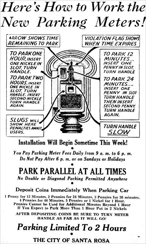
Press Democrat, February 11, 1945


A nasty squabble immediately arose between the county and city over parking spaces. Santa Rosa had installed a row of meters on the east and west of the courthouse and the county was threatening legal action unless there was free parking for designated vehicles. As neither side was blinking, the county proposed it would turn the south lawn of the courthouse into a government parking lot, requiring chopping down two mature Peruvian pine trees – which were the last survivors from the pre-1906 earthquake courthouse plaza. The PD reported on the backlash: “The number and vehemence of telephone calls coming to this office since announcement of the parking plan indicate that the removal of those trees for the purpose set forth will meet with a storm of protest, like which our county officials have never before heard.” The city caved, but it was a stupid fight to pick; what did they expect? Jurors and judges would dash outside every two hours to move their cars?

Then as Mrs. Larson poetically wrote, now comes it the crisis: the year 1946.

Thousands of soldiers and sailors were returning home to Santa Rosa where they were promised free education and cheap mortgages by the GI Bill – but found jobs scarce and nowhere to live. The housing situation was probably worse than it’s been since the 2017 fires; a special census taken that February found only 74 vacant houses or apartments in all of Santa Rosa, including places leased/sold but not yet occupied and units where residents happened to be out of town. The Press Democrat’s “Wanted to Rent” classifieds were always long, packed with veterans pleading for somewhere with a roof. Sometimes a finder’s fee was offered, including nylons.

With all those additional people on the downtown streets, the traffic situation became nigh impossible. The meters and rigorous enforcement of time limits became essential to avoid gridlock. Yet at a city council meeting the outgoing mayor conceded something had to be done besides writing lots of parking tickets (“I don’t like these wholesale citations”) and that the parking meters “have not accomplished everything wanted.” From the March 6th PD:

The mayor explained that it is “not the fault of the meters” that the parking meters have not completely solved the parking problem, but is due to the “great influx of people into Santa Rosa.” He explained that traffic has become so great that “there just isn’t room for them” in parking space now provided.

Besides sounding a bit like a Stockholm syndrome hostage to the Miller Meter Company, the mayor urged the council to acquire empty lots close to downtown for off-street parking – which would mean buying more meters, of course. (There was at least one all-day parking lot at B street and Healdsburg ave, and it was never mentioned whether the 10¢ required to park there was fed into a meter, handed to an attendant or was a purchased tag.)

To pay for the lots and other civic improvements (including “electric stop-and-go signal equipment for key intersections”), the city council used bond money and authorized Santa Rosa’s first sales tax, to predictable taxpayer howls. Although the tax was only one percent, there were calls for a complete boycott of the downtown as a kind of “Boston Tea Party” protest.

The Press Democrat’s letter section saw writers interchangeably angry between the sales tax and the parking meters, to wit: “I (Someone I know) will never shop again in Santa Rosa because I’m mad about a parking ticket (I already pay too many taxes).” But where else were they to go? Spend all that time and gas – now up to 21¢ a gallon! – driving to Petaluma for groceries or all the way to San Francisco for a fashionable hat?

Hello, Hugh Codding.

The very first real article in the Press Democrat about Montgomery Village appeared on April 30, 1950 and included this quote from Codding: “People do not like the inconvenience of looking for parking space, priming the parking meter and then walking several blocks between stores. Montgomery Village abolishes that inconvenience – all within one block of 750-car parking.” It had been a long time since Santa Rosa had heard such sweet and sensible words.

That appeared before the shopping center fully opened, and later ads would feature its other major draws: Montgomery Village was just outside city limits so there was no municipal sales tax and it had diagonal parking.

To understand why diagonal parking was such a Very Big Deal, slip into a Dacron jacket and travel with me back to 1950. Cars and pickups are classy but clunky – as large as boats and heavy as little tanks. And because they don’t have power steering (not available on any car until 1951) they require the muscles of Popeye to turn the steering wheel if the tires aren’t in motion.

Santa Rosa insisted upon parallel parking only, even though downtown merchants had been protesting it for many years. A petition for diagonal parking was presented to city council in 1940, headed by some of the top storekeepers: Lee Hardisty, Leonard Deffner, Donald Carithers and Irving Klein. Deffner, owner of the big Pershing Market between 4th and 5th streets, told the council that customers of nearby businesses were using his grocery store parking lot rather than parallel park on the street (and this is before the meters, remember). Nothing doing, said Santa Rosa – our streets are so narrow that anyone double parked would cause a traffic jam if diagonal was used. Apparently stiff fines for double parking weren’t a consideration. The city clung so hard to parallelism that in 1964 they made every third space no-parking so it would be faster to nose or back in to a spot, thus making the parking shortage 33 percent worse. Dumb decisions like that made Codding look like a genius by comparison.
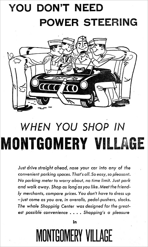
Montgomery Village ad, February 6, 1955


While Montgomery Village was thriving, Santa Rosa seemed to go out of its way to make downtown parking ever more annoying.

In 1951 (840 meters now installed) they made a deal with a company to put frames on the meter poles which could display printed ads. Local merchants hated it, didn’t advertise and the company damaged many of the meters somehow. Two years later the city incurred more public wrath by switching parking lot meters to take dimes only, thus forcing drivers to overpay if their errands took less than two hours. Overtime parking fines doubled, then doubled again.

Other Sonoma county towns followed Santa Rosa’s lead in the 1950s and installed parking meters, then later removed them under pressure from the business community. Healdsburg uprooted its meters in 1964 and the sales tax increase more than replaced lost meter income. Twenty years later Petaluma stopped meter enforcement and their Downtown Merchants Association saw business improve.

Yet Santa Rosa’s confidence in the meters remained unshakable, even while the city continues to tinker with them; a decade ago they tore the meters off most posts because consultants insisted ticket kiosks were ever more efficient and the public really wouldn’t mind hiking from a parking spot to a kiosk and then back again. This year (2018) the city extended metered parking to 8PM while also implementing a zone system, which is able to increase the cost of parking in busy areas during the busiest times – which was done because experts told the city that trick works really well in tourist towns like San Diego.

But still the ungrateful public keeps complaining and today the resentment over paid parking in Santa Rosa is louder and more frequent than ever before – although that may be because the forum has shifted from newsprint to social media, where everything is amplified and unedited.

What’s interesting is how attitudes have not budged a whit between 1946 and now. People still say they no longer go downtown because they (or someone they know) was unfairly dinged with an expensive parking ticket. Businesses still say they don’t have enough customers because of the hassle of parking. And Santa Rosa still says there’s nothing wrong with the status quo – whatever that happens to mean right then.


* There are no shortages of Hugh Codding anecdotes, but here’s a story I’ve not read elsewhere: While Santa Rosa was mulling over where to build the new city hall in 1950, Codding offered space at Montgomery Village – although it was then outside of city limits. According to the Press Democrat: “‘I thought myself it was fantastic until I got to thinking about it,’ he told the astounded [planning] commissioners.” Then as the city still hadn’t decided in 1963, he offered free land near Coddingtown in the unincorporated area. The city council didn’t snap up the deal so a week later he came back with an offer of another place, also on county land near his shopping center. And when they still didn’t bite, he tried to broker a deal to make city hall part of the new county administration center. Did he really believe he could get Santa Rosa to move the city buildings out of the city?

Read More

civic center FB

THE SANTA ROSA THAT SHOULD HAVE BEEN

Fresh back from service in WWII, architect “Cal” Caulkins had a vision: He would fix Santa Rosa. He wasn’t the first to try it – nor the last.

The downtown that Caulkins wanted to fix in 1945 was essentially what still exists now, sans our monstrous mall. It was also mostly the same as it was in August, 1853, when a surveyor named Shakely laid out a grid of a few streets centered around a small plaza. And that’s the problem: Once we scrape away all the built-up crust, the layout of Santa Rosa was – and still is – a mid-19th century village. The town motto should be changed from “The City Designed For Living” to “The City Designed For Living…in 1853.”

Santa Rosa quickly began to outgrow its modest framework. The next year it became the county seat, which led to a courthouse, county jail and county records building packed around the village square – and even that centerpiece was lost in 1884 when the next courthouse was built in the middle of it. Santa Rosa’s plaza hadn’t been much to look at and there were ongoing problems of stray cows and pigs taking up residence, but at least it was a public open space. Now the village town didn’t even have a park, and it would be 1931 before Santa Rosa had a true public-owned place (thanks to the donation of the nine acre Juilliard homestead).

Nor did Sonoma’s county seat have a building where lots of people could assemble. The Athenaeum opera house was used until it fell down in the 1906 earthquake; afterwards  large public meetings were held at the roller skating rink, a movie theater or at the armory. The Burbank auditorium at the junior college opened in 1940 and could seat 700, but that was pitiable compared to cities like San Jose, which had a civic auditorium that could hold 3,500.

Elected officials and town boosters sought piecemeal fixes, apparently never recognizing the problem was the town’s underlying design. Another gripe concerned the narrow streets; immediately after the 1906 earthquake pulverized much of downtown, Press Democrat editor Ernest Finley pushed hard to widen all principal streets in the business district so they could accomodate electric trolley cars (only two blocks of Fourth street were modified).

Same with the park and auditorium issues; they knew a park with some amusements would draw Bay Area tourists and a large hall which could host conventions were both reliable money-makers. They spent nearly fifty years off and on trying to create a park but it always ended the same ways: The town couldn’t afford the land, they feared voters wouldn’t pass a bond or there was too much heavy lifting involved.

The solution to both problems seemed at hand in early 1906 when architect William H. Willcox proposed creating a waterpark via a dam on Santa Rosa Creek, turning it into an urban lake. It would be the centerpiece of the town with a section for swimming and water sports, benches and paths illuminated with strings of light bulbs (très moderne!) on both banks and a kiosk jutting over the water for bands to entertain. He also had designed a convention-style auditorium that could seat 2,500, which made him the darling of Santa Rosa’s business elite; they had pledged almost the full amount to start construction – and then the earthquake hit. For more on both plans, see “SANTA ROSA’S FORGOTTEN FUTURE.”

It would be almost forty years before someone came along and tried again, and that would be Cal Caulkins – who also tackled Santa Rosa’s underlying problems head-on.

Cal Caulkins’ career up to 1945 was introduced in the previous article, which explained some of the architectural styles he used and offered a walking tour of his typical work. If you haven’t read that piece it’s important to know he was Santa Rosa’s top architect at this time and a well-respected civic leader; anything he proposed would be weighed quite seriously.

The public first saw his design in the August 19 edition of the Press Democrat. The accompanying article in the PD was headlined, “Master Plan Urged for City’s Future.” A second banner over the drawing announced, “A Postwar Vision – ‘Face Lifting’ for Santa Rosa.”

Although the plan was entirely his, the germ of the idea came from Press Democrat editor Herbert J. Waters, who had published an unusual above-the-masthead editorial six months earlier. At the time there was much debate concerning the need to expand the county courthouse, with either an annex somewhere else or via adding a third floor “penthouse on stilts” to the existing building, estimated to cost a staggering $325,000 – with most of that going to reinforce the structure.

Waters was also peeved by an American Legion committee which had just asked the city to use Fremont Park as the site for their future war memorial building. Besides the loss of a scarce public park, he decried scattering new public buildings all over town just because there was land already owned by Santa Rosa. He called instead for a long range plan to create a civic center on the banks of Santa Rosa Creek. “With beautiful Juilliard Park and the famous Luther Burbank Gardens as approaches, such a civic center could be one of the most attractive in the country” – and remember that was in 1945, when the Redwood Highway went through downtown.

Although Waters’ ideas were quite sketchy, Caulkins took that vision and expanded it greatly. What he designed was simply brilliant.


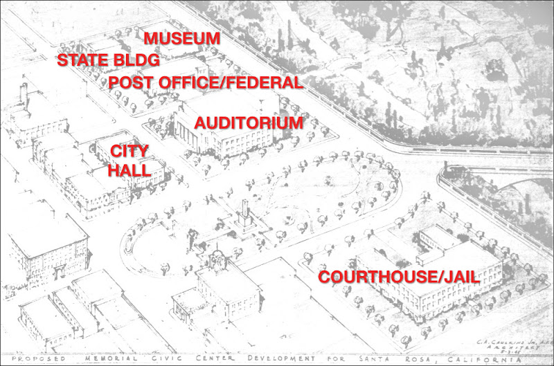
Cal Caulkins watercolor of proposed Santa Rosa Civic Center. PD, June 15, 1953
Key to Caulkins’ proposed Santa Rosa Civic Center


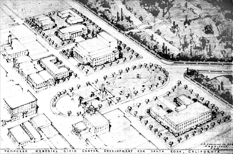
Cal Caulkins pen and ink drawing of proposed Santa Rosa Civic Center. PD, August 19, 1945


He produced both a pen and ink drawing of the plan that appeared in the PD and a large watercolor that he loaned out for display and used as a backdrop during his frequent speaking engagements that autumn.

What he was calling the “Memorial Civic Center” provided Santa Rosa new open space via a walkway to the point between the confluence of Matanzas and Santa Rosa Creeks. The undersize courthouse square was gone, replaced by a landscaped plaza stretching from Fourth street to First (although its roundabout shape might have tempted jalopy racers to think of the Circus Maximus).

Like Willcox he glorified the Creek, turning First street – long the junky part of downtown with scattered shacks, the grimier auto repair shops and farm equipment resellers – into a scenic drive as well as the main connector to the neglected working class southwest neighborhoods.

No question: This was the best of all possible Santa Rosas, and all that was needed to start the wheels moving would be for voters to pass a measly $100,000 bond.

What could possibly go wrong?

Seemingly everyone loved Caulkin’s plan. It was endorsed by the Chamber of Commerce, the Board of Supervisors, labor unions, service clubs, veteran’s groups, women’s groups and politicians of all stripes. The Press Democrat ran a banner on the front page reading, “Santa Rosa’s Future is at Stake.” It looked like a done deal.

Some of the enthusiasm was surely part of the prevailing “can do” optimism that lifted the nation from the spring of 1945 onward, once it became clear the end of the war was approaching. Everyone was looking forward to making their own little corner of the world not only whole again, but better; in Sonoma county, a committee was formed to explore creating a “Redwood Peace Temple,” which apparently was to be sort of a Bohemian Grove-ish annual summit for world leaders (albeit hopefully without those notables drunkenly pissing on trees).

Nor did there seem to be concerns about how to pay for everything. It was promised there would be cost efficiencies in clustering the federal, state, county and city buildings so close together, with money coming from all four sources. Santa Rosa was already in queue to get $500k for a new post office, there was property tax money to fund war memorials all over the county (thanks to a temporary change in state law) and besides, everything did not need to be built at once; they could start with the war memorial and build the other stuff when the money came in. Pay as you go, postwar style.

To launch the project, Santa Rosa asked voters for a $100,000 bond to acquire the war memorial site. It was a crowded ballot for a non-election year, with seven bonds worth $845k plus four other items, but nothing was pushed harder for approval than the war memorial. In the weeks before the vote hardly a day went by without an item about it in the Press Democrat; we were told it was a good investment because it would attract conventions and the (expected) matching grants would make construction virtually free. A coalition of veteran’s groups formed a joint committee to get the voters to the polls. And although December 4 ended up being a miserable day with a hard rain, half of all registered voters turned out.

It lost by 96 votes.

The PD was editorially silent about the defeat, but it was the #1 topic in letters to the editor for the rest of the month. A single writer cheered its failure; another person begged for someone to explain what happened – but mostly people pointed accusing fingers at the American Legion.

Simply put, there was distrust about the Legion’s involvement with the War Memorial project. This came up right after Caulkins’ plans were published, when County Supervisor Guidotti remarked, “…only recently a group of Santa Rosa legionnaires appeared before our board and their spokesmen, in effect, admitted that they only wanted a building for themselves and to [hell] with anybody else.” Similarly, when the legionnaires earlier proposed the Fremont Park site to the Santa Rosa city council, they were asking the city to use its share of the tax money to build them a meeting hall along with granting a 99-year lease. They would not commit to allowing other veteran’s groups to use the building and it was an open question whether they would even let the general public use it. Leaders from the VFW and the Disabled American Veterans were at the meeting to complain they were locked out of discussions.

One letter writer was generally incensed by the “apparent attitude of the Legion toward veterans of World War II,” noting that the Legion in San Francisco had recently refused the American Veterans Committee (AVC) use of the war memorial there. (Now defunct, AVC was a progressive group focused on problems facing WWII vets, particularly homelessness.) The Legion claimed they denied access because AVC was not “pure” since merchant marines could join, but one might also wonder if that was a sneer at AVC for being racially integrated, while the American Legion had separate posts for white and black veterans.

Whether the legionnaires should be blamed for killing the Civic Center project is moot. Without that $100,000 there would be no war memorial downtown – and with that, the dream of a Santa Rosa Civic Center was dead. Its failure to pass left a county supervisor questioning if taxpayers wanted those war memorials at all. What happened next was covered here in “THE VETS WAR MEMORIAL WARS:” Soon after the county bought some land in the Ridgway neighborhood for the Santa Rosa auditorium, and when that didn’t work out decided to build it across from the fairgrounds.

But Caulkins’ Civic Center was not forgotten; for years, mentions kept popping up in PD letters-to-the-editor as well as in articles and columns whenever the subject of downtown improvements came up. His watercolor was displayed in a window of Rosenberg’s Department Store in 1951. When in 1953 the county began making plans to build an administration center north of Santa Rosa city limits (at its present location), the Chamber of Commerce and others urged the supervisors to consider a scaled-down version of Caulkins’ downtown design. Caulkins told a reporter he was “besieged” with calls afterwards and the PD ran an illustration of his color drawing alongside an article about it.

There were other attempts to fix Santa Rosa’s design problems in 1960-1961, when the city’s new Redevelopment Agency hired urban design experts from New Jersey. Some of their ideas were pretty good; they envisioned a pedestrian-friendly city with mini-parks, tree-lined boulevards and a greenway along both banks of a fully restored Santa Rosa Creek. Their objective was to improve traffic circulation so the public could drive as quickly as possible to a parking garage/lot and walk from there. In a nod to Caulkins’ work, they proposed the combined county courthouse/jail in a park-like setting on the south side of Santa Rosa Creek.

To their credit, the NJ experts were concerned that Roseland was cut off from the town and wanted a highway 12 exit for Sebastopol avenue/road; to their shame they first proposed eliminating courthouse square, then chose to cut through the center of it. But this is not the time to further discuss the 1960s urban renewal misfires – that will require another lengthy essay or three.

Nothing in the Waters-Caulkins layout survives, except for the removal of part of Second street. (For those like me who have always wondered if that section of the street disappeared in order to wipe out any trace of the old Chinatown, Herb Waters admitted as much in his 1945 editorial: “Our former ‘Chinatown’ in Second street comes as close to slums as anything we have in Santa Rosa, and its removal would certainly occasion little economic loss.”)

But the Santa Rosa that exists today bears little resemblance to what any of those 1960s experts designed, either. Santa Rosa Creek was entombed in a box culvert, although that was the natural feature everyone wanted to highlight; what government buildings that are still downtown are a mishmosh of styles, most already badly dated. While beneath it all, the old grid of village streets from the 19th century still constricts us in the 21st. And no, we can’t blame any of those bad decisions on the American Legion.

Read More

bnview

TODAY YOU SAW CAL CAULKINS

Don’t panic, but we’ve been surrounded. Travel around Santa Rosa (and to a lesser extent, Sebastopol) for ten minutes and it’s likely you’ll encounter one or more buildings designed by “Cal” Caulkins, Santa Rosa’s top architect roughly between 1935-1960. Outside of the neighborhoods built by Hugh Codding, no other person did more to define the look of Santa Rosa than Caulkins.

He was also prolific. By going through the Press Democrat archives he can be found named as the architect on over 100 different buildings, and that’s not counting projects that were dropped or reassigned, projects that were simply remodels and, of course, projects that weren’t mentioned in the paper. I found references to 17 Santa Rosa houses and believe the true number is 2-3x more – either that, or there was an army of contractors here during the late 1930s doing Caulkins knockoffs.

The residential buildings he created are not artsy or pretentious – but neither are they boring and repetitious like the Codding houses. But most of his work was not in designing houses; he did about twice as many civic or commercial buildings (including a roller skating rink), a couple of dozen schools and a handful of churches. His masterpiece is probably the Art Deco-style goliath on Fourth street which is now home to Barnes & Noble (more about that later) but everything he designed has merits. A chronological list of all his known work can be found at the end of this article.

The “Caulkins style” is pretty easy to spot once you know what to look for, and I’ve created a mile-long walking tour that will showcase most of the elements seen in his work. But before putting on those hiking shoes, a little background is helpful. There were five main “styles” that he used throughout his career – and as we’ll see on the tour, he often moshed them together:

* SPANISH COLONIAL   Stucco walls sometimes with carved bas-relief details; tile roof; terracotta attic vents; arched entryways; decorative ironwork. Caulkins apparently called this “Early California.”

* ENGLISH-NORMAN   Hybrid style popular in the 1920s-1930s and also called Tudor-French Norman style. Stucco walls with half-timbering often more curvy and elaborate than simple Tudor; casement windows; cross-gabled with a steep hipped roof and the entryway beneath its own gable or part of a tower.

* COLLEGIATE GOTHIC   General 20th century style for brick or stone campus buildings to appear old, per Oxford and Cambridge. See this article on its history. (h/t to John Murphey for the name)

* STREAMLINE MODERNE/PWA MODERNE   Simplified version of Art Deco often intended to mimic 1930s automobile styling; curved edges, glass bricks, casement window pairs on corners, aluminum or even chrome trim. PWA (Public Works Administration) Moderne was another offshoot of Art Deco popular for public buildings in the 1930s-1940s.

* MID-CENTURY MODERN   Single story with maximum window space making walls as transparent as possible; flat roof, sharp angles, multiple exterior entrances preferred to hallways; often intended to look prefab or modular.

Also before we begin, full disclosure: I have a personal dislike (strike that: indifference) for much of his architecture, but my bias is not against his work specifically – I just don’t have a taste for any form of modernist architecture, which had its heyday during the same decades as Caulkins’ career. To me the “moderne” styles are Art Deco without the art, often making me think of bus stations (Caulkins did remodel the Greyhound station here) or Los Angeles’ oppressive downtown civic buildings (my long-running joke has been the style should be renamed, “Sepulveda”). The many elementary schools he designed in the mid-century modern style probably looked outdated by the time the first kindergarten students graduated high school.

At the same time, Caulkins did his best with what the clients of his era demanded. Those schools that appear mired in the ugly 1950s had an innovative baffle roof (invented by Caulkins) to bring in natural light to the side of the classroom farthest away from the big windows. Each of his residences in historic revival styles had its own unique touch in some significant way – unlike the cookie-cutter Codding houses. And while his cottage-type homes were designed for families with middle class budgets, they don’t look cheaply made. Another difference from much of what Codding built. So.

Our walking tour begins at the corner of Tenth and B streets, which might as well be called the intersection of Streamline and Moderne. Here are two of Caulkins’ best examples kitty-corner from each other. Use the Google street view below for orientation (or if you’re not walking, follow the arrows as directed):

Standing from the Google viewpoint, the building closest to the camera is the 1940 Thurlow Professional Building. On the distance on the other side of Tenth street is seen the 1938 Hamlin Medical Building. Note the large overall area of wall space devoted to windows on both, as well as corner windows wherever possible.

The SEIU building at 600 B street shows more of a debt to Art Deco, mainly because of the door and torch lights on either side (although I don’t know if these were original). Ribbons in the concrete steps lead to the entryway with its aluminum canopy, which is repeated on the side. The entrance is in the middle of the building, yet the window layout is asymmetrical.

Walk across the blocked intersection island (uh, why is it there?) to 576 B street. The imposing pilasters give it that heavy PWA Moderne look, although the corrugated metal cladding adds much needed color. Note the caduceus medallion at the top from its old days as a medical building – which is a bit awkward as the offices have been used by lawyers and accountants for as long as I can remember.

Proceed up Tenth street to see the side of the building, again packed with metal frame windows, including every corner. The arrangement of the windows is asymmetrical although edges line up vertically.

Continue up Tenth and turn left at the stop sign, walking to the intersection of College and Mendocino avenues. Cross College ave. at the stoplight and proceed left (west) on College. Turn right (north) at the first street on Glenn, and then two short blocks to Benton street.

There are at least five Caulkins homes in this general neighborhood – and likely more we don’t know about – making it Ground Zero for his residential work. One reason there may be so many is because he lived at 100 Ridgway avenue (now cut off on the other side of the freeway) during the 1930s and early 1940s.

The 1937 Douglas house at the corner of Glenn and Benton streets is a fine example of how adept Caulkins was at tinkering with the popular styles of his day. While all that half timbering and the steep roof screams jolly olde England, one doesn’t notice the other stuff that’s completely discordant. The many dormer windows are extremely large for the house – but since he used shed roofs instead of the usual Tudor gables, they don’t draw much attention. (I’d also argue that without the distracting half timber the house would look top heavy.) And look: Metal frame casement windows on three corners, à la Streamline Moderne.

Continue walking north on Glenn street one block, to the intersection with Denton Court/Denton Way. The cul de sac site was the subject of much controversy in 1949, as Santa Rosa wanted to put the War Memorial Auditorium there – yes, the same hulking building now across from the fairgrounds (and designed by Caulkins). It’s a long story, explored here in “THE VETS WAR MEMORIAL WARS.”

Turn east on Denton Way, walking on the right side of the street. You will pass two more Caulkins houses at #432 and #446, built respectively in 1935 and 1936. Aside from mentions in the Press Democrat, we can ID these as Caulkins houses because of…wait for it…corner window pairs. (The windows at #446 are updated.) The newer house also has a unusual feature also found on the Chamber of Commerce model home he designed about the same time: A tall, swept standing seam canopy draping over a bay window.

At the end of Denton Way is the 1937 house for Acme Beer baron Floyd Trombetta. It is the largest of the Caulkins homes in the area and the one most conforming to a style, here Spanish Colonial Revival – no Streamline Moderne windows this time. He did somewhat break stride by putting the entryway in a tower, per the English-Norman hybrid.

Proceed north on Mendocino avenue. You’ll immediately be in front of St Luke’s, which Caulkins designed in 1945. It is supposed to be “Tudor English Gothic,” but aside from some of the fenestration I wouldn’t have guessed.

Walk north to the stoplight at Ridgway ave. where you should cross Mendocino ave. to the east side. Continue two short blocks to the Crawford Court intersection.

Cal Caulkins 1936 drawing of the Trombley house, 1122 Mendocino ave


On the corner is the home Caulkins designed in 1936 for his friends, the Trombleys. “Professor” George Trombley was Santa Rosa’s premier music teacher and founder of the Santa Rosa Symphony in 1929. Although it’s now altered and broken up into apartments, this was a showplace when it was built; the Press Democrat printed his drawing at least twice, along with a lengthy description of how “ultra modern” it was. And yes, there were corner windows.

Cross the street back to the west side using the pedestrian stoplight and continue north until you reach the Santa Rosa Junior College gate. This was designed by Caulkins and dedicated June 15, 1935 in a ceremony including the widow of Luther Burbank. Here would be built a grand college, the arch promised.

In the years that followed, Cal Caulkins designed ALL of the original buildings on the campus. If he had created no other architecture in his life, he should be remembered for that.

His full name was Clarence Adelbert Caulkins Jr., although everyone called him “Cal” – which has caused some to mistakenly assume he was a Calvin. He was born 1899 in Montana and studied architecture at UC/Berkeley, where he worked for years with John Galen Howard, who designed the Empire Building and would have given Santa Rosa several other memorable buildings had our civic leaders not gone on the cheap.

Caulkins moved to Santa Rosa around 1932 and partnered with William Herbert, an architect who had been here for about fifteen years. Curiously, the prolific Caulkins is now all but forgotten while Herbert’s prestige as “Santa Rosa’s first architect” has risen – even though he accomplished little.

Today Bill Herbert is falsely credited with projects such as the original Luther Burbank school (sorry, it was built about ten years before Herbert showed up) is credited with the second Luther Burbank school built in 1940 and the designs which appeared during the firm’s sudden burst of activity that began once Caulkins joined the firm. Herbert is often named as the architect for Sebastopol’s 1935 Park Side School, for example, although the design is clearly in synch with Caulkin’s version of PWA Moderne. What Herbert did accomplish was mainly in the 1920s, particularly as being the supervising architect during the construction of Santa Rosa High School. He was also Santa Rosa’s building inspector for a number of years. Only two surviving examples of his solo architecture still can be found in Santa Rosa – a modest house at 418 Denton Way and the “Von Tillow Block” at 616 Mendocino ave., home to the Round Robin dive bar. Although William Herbert was said to be an MIT graduate, I’ll wager it was in a field of study other than architecture.

Scan the list below of the work produced by the Herbert & Caulkins office in 1935 and be humbled – two major schools, the first Junior College building (the gym), a major office building and four houses in Santa Rosa, one of them a place in Proctor Heights that the Press Democrat called “palatial.” There were probably more; next door to the house at 1121 St. Helena ave. is another from the same year, both exactly using Caulkins’ English-Norman vocabulary. And a couple of doors away is #1107, which was used as a model home for a time, eventually becoming the Caulkins family home. And on top of all that, he did a design for the county hospital (seen here).

(RIGHT: May 8, 1936 Rosenberg store fire. Photo courtesy Sonoma County Library)

When Caulkins opened his own office in 1936, things got really busy for him. There were at least seven more houses including the Streamline Moderne showpiece for his friends, the Trombleys. And then the disaster of May 8th happened.

The fire at Rosenberg’s Department Store was most devastating event in Santa Rosa since the Great 1906 Earthquake. The fire was so fierce there was concern that the city reservoir might not have enough water to fight it. Firemen from all over the area needed several tense hours to bring it under control.

The Rosenbergs vowed immediately to rebuild – and as the lost building’s upper floors were a major hotel, there were two businesses to restore. They gave Cal Caulkins the commissions for both.

The site at Fourth and B (currently the CitiBank building) was to become the New Hotel Santa Rosa as soon as fire debris was cleared and the blueprints were ready. The department store would be built on the half-block at Fourth and D, which was then a gas station and a garage. The Rosenbergs already owned the portion of Third and D which is still used as a parking lot behind the store.

The New Hotel Santa Rosa opened in December 1936, just seven months after the fire which is nothing short of amazing – three shifts of construction workers were kept busy 24 hours a day.

The exterior of the hotel appears plain and rote, but that’s only because all photos are in black and white; when it opened the PD spent a paragraph praising Caulkins’ innovative use of color – yet without describing what the colors were. Inside the design straddled Moderne and Art Deco. Aluminum bands were used there as well to create strong horizontal lines with indirect lighting cast upward from the pillars. These features continued in the dining room, which could seat 350 (!) and had walls painted in brown, yellow and apricot, which might well have been the muted exterior colors as well.

New Hotel Santa Rosa.  Photos courtesy Sonoma County Library


But also in December the paper revealed the San Francisco firm of Hertzka & Knowles were the architects for the department store. Nothing was said of why they were replacing Caulkins – or if he was being replaced completely.

Since the days immediately after the fire, Caulkins had been talking up his design to reporters and a drawing of his appeared in the PD less than three weeks afterward. Those early articles show plans were very much in flux; the paper said it would be a one story building with a mezzanine, then soon after that it could be up to six stories high with “a battery of elevators and escalators.” His drawing shows a building half again as large as what was built. Consistent throughout was that Fred Rosenberg wanted the place to look hip; according to the PD, Caulkins was “instructed to design the store as ultra-modern as possible…it will be of moderne architecture, with Caulkins intending to call for considerable use of a new-type structural glass and chrome-plated ironwork in his plans.”

The second drawing below appeared just before construction began and was most likely done by H&K. The most striking difference between Caulkins’ early drawing is the tower, which reached the building’s six-story potential – as the tallest structure in town, it was said to be like a beacon when illuminated at night. Aside from that, his preliminary sketch of a much larger building is recognizable in this later drawing, particularly the strong vertical decorative elements on the face contrasting with a stack of belt courses wrapping all the way around. And there’s plenty of that glass brick which Caulkins was intending to use.

Cal Caulkins preliminary drawing for Rosenberg’s Department Store. PD, May 26, 1936


Final (?) drawing unsigned for Rosenberg’s Department Store. PD, Jan 21, 1937


Whether H&K completely took over or collaborated with Caulkins is unknown, as is whether the final design belongs to him, them, or both. I’m inclined to believe all of the store’s interior and most of its exterior should be attributed to Caulkins; as seems to be the case with the hotel, there’s an originality in the design which defies simple definitions of what Art Deco or Streamline Moderne is “supposed” to look like. Nor can I find any examples of Hertzka & Knowles designing anything else that looks like this store. In 1941 they created the Leader Department Store in Petaluma (later Carithers) and that’s best described as being more in the International style, so devoid it is of any artistic features.

What does seem clear is that the poor guy was overstretched when construction plans were being finalized at the end of 1936. Besides the two enormous Rosenberg projects and the houses, a major problem arose at the Junior College while constructing his second building, causing all work to stop (the lumber was poor quality). With pressure to open the hotel doors ASAP, Caulkins would have had to be superhuman to give the department store project his full attention, what with the required budget breakouts, contractor bids, and million other last minute details large and small. Construction on the store began in January 1937 and its grand opening was shortly before Hallowe’en the same year.

Caulkins stayed incredibly busy over the next few years – check out the timeline below. In 1938 alone he designed Burbank auditorium and three other major buildings at the Junior College. He also became president of the Rotary, which seems to have been a full-time job, judging be all the doings reported in the news. And when WWII happened he went away for three years as a civilian employee designing dorms and housing for the Navy, becoming the architect for the entire Naval District in the Bay Area.

And now the obl. Believe-it-or-Not! surprise twist: Everything you’ve read here so far about Caulkins is just prelude to the really interesting story.

When Cal came back from the war, he had a vision to redesign almost all of Santa Rosa’s downtown core from the ground up. Instead of the grid of streets which had been  platted out way back in 1853 when there was only a couple of houses, a tavern and stray pigs, Caulkins envisioned a magnificent modern civic center to serve the town and county, something which likely would have turned us into a model city of postwar reconstruction for the entire United States.

The Chamber of Commerce loved the idea, as did the labor unions, service clubs, veteran’s groups, women’s groups and politicians of all stripes. The Press Democrat ran a banner on the front page reading, “Santa Rosa’s Future is at Stake.” It looked like a done deal. And then came December 4, 1945 – a day that will live in a kind of infamy.


CAL CAULKINS ARCHITECTURE


1932
Corning Union High School gym – Tehama county  (w/ Herbert)


1933
Webb & Bowman building – fuel oil and boilers 3rd and Main (w/ Herbert)


1935
Usseglio house 432 Denton Way
Chamber of Commerce model home 1621 Proctor Terrace – English cottage (w/ Herbert)
Proctor house 2445 Sunrise Place/Proctor Heights  – Mediterranean  (w/ Herbert)
SRJC gate dedication June 15 Mrs. Burbank
SRJC gym (w/ Herbert)
Sebastopol Union Elementary School – now Park Side (w/ Herbert)
Farmer’s Mutual Insurance 631-635 Fifth st (w/ Herbert)
Malm house 1121 St. Helena ave (w/ Herbert)
Cloverdale Union High School  (w/ Herbert)


1936
Eicher house 438 Denton Way
Call house 928 McDonald ave
Talbot house 201 Talbot ave
Rapp house 236 Talbot ave
E. Stewart house one story early California style
George Bech house 210 Palm ave Sebastopol enlarge and alter
Trombley house 1122 Mendocino ave
SRJC “home science and commercial” building
Rosenberg’s Department Store
Hotel Santa Rosa 4th and B, 508 Fourth st – see PD 12/4/36
Trombetta house 821 Mendocino ave
D. W. Douglas house 354 Benton st
H. T. Graves house 1421 17th st
WPA community center at Howarth Park (proposed – built?)
Stone co. new bldg + alter  625 Fifth st
Ralph Brown house 1612 Bryden Lane


1938
Hamlin medical bldg 576 B st
Knowlden Court apt building 502 Santa Rosa ave (now Economy Inn)
Challenge Cream and Butter Santa Rosa ave
auditorium for Fremont school
county hospital nurse’s quarters
doctor office remodel  1116 Mendocino ave (next to Trombley)
Burbank auditorium, 3 other major JC buildings – PD 9/8/38 – open Jan 1940
roller rink at south entrance Santa Rosa Redwood Hwy near Triangle


1940
Clark Avery house 219 Doyle Park Drive
Thurlow Professional Building 600 B st
Ives Park pool and rec buildings, Sebastopol
L. Grant Kellogg house hillside east of Santa Rosa (59b Adobe Canyon Rd?)
Ukiah fire station and jail
houses for doctors in Ukiah, Willits, Mendocino, Eureka


1941
Building Trades Temple 636 Third st
Seidel house Petaluma – early colonial


1945
Mendocino county hospital
St. Luke’s 905 Mendocino Ave built 48 “tudor english gothic”
Lessard Paper co. Sebastopol ave and Olive corner


1946
Sears – 7th st block between A and B 75000 sq ft opens 1949
Dodge-Plymouth dealership 955 Redwood Hwy S
Buick dealership Redwood Hwy S “automobile row”


1948
Ling furniture store 1044 Fourth st
Doyle Park school built 1950 (now Santa Rosa French-American Charter)
Ben Hall bldg SW corner 10th and Mendocino ave


1949
SRJC assembly hall and music bldg
Fremont grade school (demolished now Charter School for the Arts)
Middletown Unified School
Mark West Union School
American Trust Co. bank corner of Fourth and Exchange
Belleuve Union Elementary School (Kawana)
Carniglia house 1940 Grace Drive
1949 remodel of courthouse basement for county surveyor and road commissioner
Mendocino county courthouse
Mendocino union high school


1950
First Presbyterian 1550 Pacific ave (early sketches gothic)
IOOF Hall Santa Rosa 545 Pacific ave
Charles Niles Jr. house 2111 Linwood ave


1951
Greyhound expand and remodel 5th and B
Forestville Union Elementary school new wing
Flowery Elementary School Fetters Hot Springs
Sharrocks house 931 Litchfield ave Sebastopol
Roseland elementary admin + addition  985 Sebastopol ave


1952
Harmony Union School District, Occidental built 1957
East Petaluma fire station
Ukiah High School gym


1953
Doctor’s bldg 1158 Montgomery Dr


1955
Christian Scientist 330 Hope st
Welti Funeral Home 1225 Sonoma Avenue (now Daniels Chapel of the Roses)
car wash between Santa Rosa ave and Petaluma Hill Rd


1956
Cinnabar Elementary School


1957
Cotati Elementary School


1958
Veterans Memorial Sebastopol
Twin Hills Union Elementary School


1959
Alexander Valley Union School addition


1961
Roseland elementary 950 Sebastopol ave (new school or 5 room add to Sheppard school?)
Office of Civil Defense – recondition buildings at Naval Air Station Sebastopol Rd.


1962
St. Stephen’s Episcopal Church 500 Robinson Rd Sebastopol


1963
Salvation Army 115 Pierce st
store 112 N Main st. Sebastopol (south of People’s Music)
Newberry’s store Fourth st additions and renovation


1964
Knox Presbyterian 1650 W 3rd St


(Year Unknown)
A. Z. Blackman house 549 Talbot ave
Carl Livingston house “Circle 3L Ranch” Santa Rosa (7639 Sonoma Hwy?) early american
Yaeger & Kirk offices 701 Wilson st (now Copperfields warehouse)
Congregationalist church Oakland
Lewis school additions
Lakeview, Eucalyptus school districts projects
Point Arena school
Upper Lake school
Round Valley school


CAL CAULKINS CAREER EVENTS


1935
plans for American Legion bldg south of Julliard park between Santa Rosa av and A
preliminary plans on county hospital


1937
1937 settles $1100 claim for prelim plans on county hospital $800 (John Easterly final)


1938
mainly four SRJC projects, Rotary president


1940
Nov. issue Architect and Engineer feature


1941
Hogan house in Yokayo subdivision Ukiah wins award


1942
May – active duty on dorms, housing for Richmond/Vallejo farm/defense workers


1943
civilian employee of Navy in SF


1944
architect for 12th Naval District


1945
Andre Morilhat, C. J. Harkness joins firm


1946
North Bay rep for AIA


1947
Santa Rosa Memorial Hospital preliminary plans (not used)


1952
“Caulkins Plan” seismic survey of all downtown bldg. mandated retrofits


1959
President Santa Rosa Downtown Development Assoc

Read More